Reducing Guest
Return Friction
Closed the gap between guest checkout and self-service returns across 8 surfaces. No account required.
Background
Zappos guests who checked out without an account had exactly one way back into their order to start a return: the confirmation email. Shopbop, on the same design system I own, already had three. Leadership commissioned a UX audit of the guest return experience after Voice of Customer data surfaced a clear pattern: guests creating accounts specifically to return an order, then finding the account couldn't see the order they'd just placed.
I led the audit and the redesign solo: research, information architecture, copy, interaction design, spec, and handoff.
Impact
The redesign touches 8 surfaces: the confirmation email, the shipping email, site search, the return flow itself, FAQ, Contact Us, and the shipping and returns policy page. It also closes a Sev-2 security gap along the way. It's approved as P0 and currently in development. Outcome metrics aren't in yet, so the numbers below describe scope and diagnosis, not results.
Research
I analyzed 18 unsolicited customer service contacts about returns using open coding, with no hypothesis going in.
"I ordered as a guest and trying to return this order for a smaller size. I set up an account today but it shows 'no order number found'."
"I am attempting to return this order, but I ordered as guest and cannot sign in from the website."
"I want to return them [shoes]. I saw sign up for an account as the way to do that today. So I created an account with my email. Zappos doesn't have my email account connected to my order."
Key finding: a third of the sample created an account anyway
Every contact in the sample had already reached customer service, so this shows how the failure happens rather than how often. A third of the customers didn't just fail to find the return path. They inferred that an account was the way to get it, created one, and hit a second wall, because guest orders don't retroactively appear in a new account's history.
"I saw sign up for an account as the way to do that today. So I created an account with my email. Zappos doesn't have my email account connected to my order. Can you help me initiate a return?"
Why the failure didn't show up in account-creation metrics
I had no account-creation metric for this; this is a reasoning point about how the failure hides, not a number I measured. Tracked only by account creation, this behavior reads as conversion. It isn't.
The confirmation email was the only door. Miss it, and there was no other way in, and the account a guest created next did not surface the order. Both halves had to be fixed.
Diagnosis
The site wasn't silent about returns — it was actively pointing guests toward an account.
Searching "Returns" opens a login prompt. The reasonable inference for a guest: an account is required.
The policy page never mentions guest returns. It explains the policy; it never says where to start.
The only page with guest instructions sits behind Help and Support, on the website only.
The app doesn't allow guest checkout, so app-only customers can't hit this problem, which scoped the fix to web.
The destination page already existed.
The order confirmation email already contained a working entry point. Clicking the order number opens the full manage-order page: status, tracking, cancel, return. The capability was built; it was labeled like a reference number, not a link, so guests didn't read it as one.
"The email I received instructed me to start the return process by clicking on the order number, but nothing happened when I did."
The fix is copy, IA, and layout — no new functionality required.
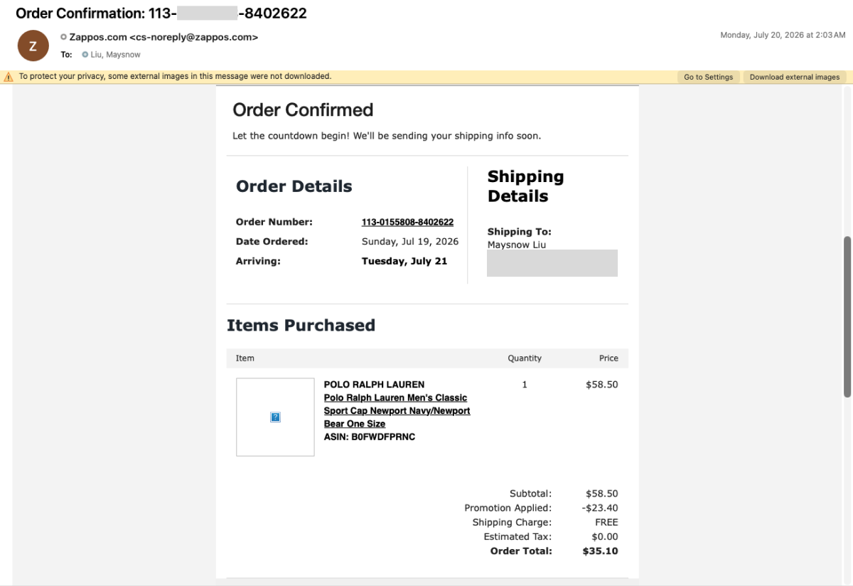
Before: the order number was the only link, and nothing named the task
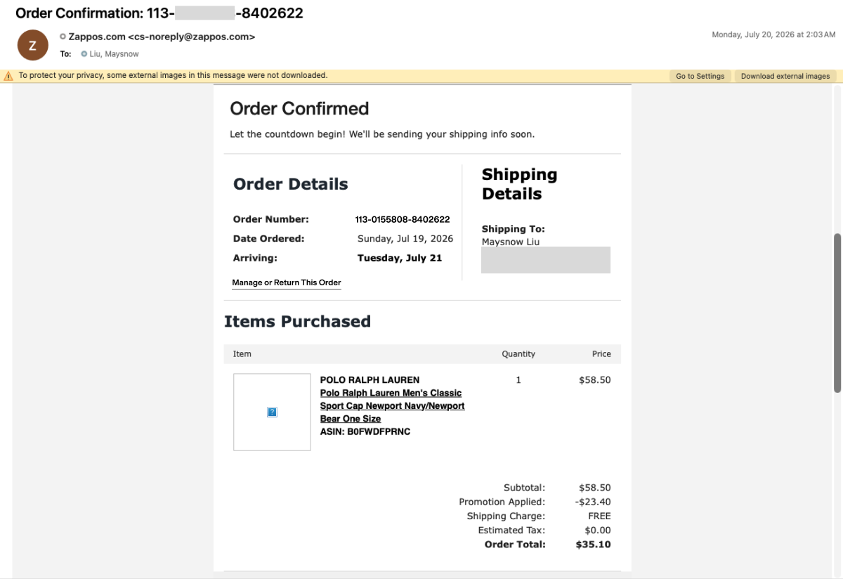
Proposed: "Manage or Return This Order" added as a labeled action
Competitive precedent: Shopbop
Before designing anything I checked Shopbop, same parent company and a brand I also own the design system for. It already has a "Find Guest Order" link under Help, a page that takes email plus order number, and a third entry point from the return policy: three ways in, one destination. Zappos had the destination and none of the ways in. That precedent scoped the Zappos fix to parity with Shopbop: guests only, one destination page.
Design solutions
Layout: equal-weight entry points
I tested four layout options for the lookup page. Three gave the guest path a button and the account path an inline text link, giving the account path more visual weight, the same imbalance this project existed to fix.
Side by side. Button sized to content.
Side by side. Button spans the column.
Stacked, full width.
The final layout is the only one where both paths get a button — two doors, equal weight.
- 2 options, side by side: each with its own action button, evenly spaced. The layout carries the parity.
- Links moved to the bottom: so they stop competing with the two primary paths.
- 2 return methods outlined: visuals and short lines, because customers compare methods at a glance.
- Wording made actionable: the only copy change on this list.
- Guest inputs side by side: email and order number in one row, saving vertical space.
- Submit button shortened: a full-width button reads as the page's only option.
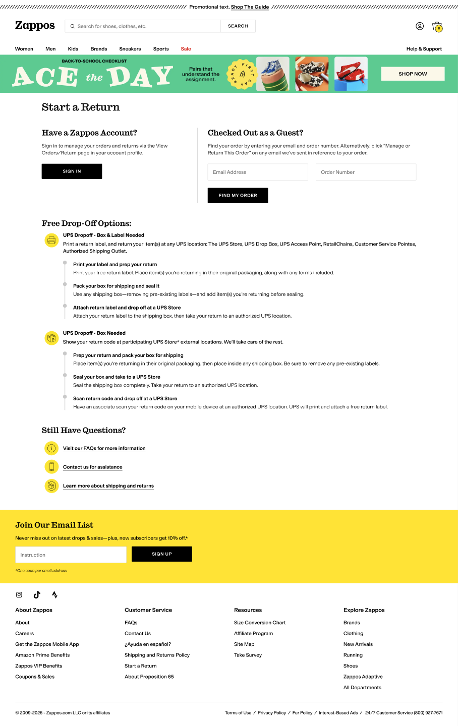
Shipped to dev: both paths get their own heading, copy, and button
Failure state
Email plus order number lands on the same order page the email link reaches: status, tracking, cancel, return. Most of the design work is in the failure case, since that's what the verbatims describe.
2 options side by side, each with a button; links moved out of the primary paths; 2 return methods shown, not described.
Says why it happened, names the confirmation email that works, and offers Contact Us instead of a dead end.
"I started an account but it doesn't recognize the number as belonging to me."
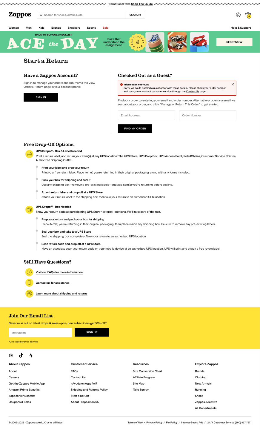
The failed-lookup state names the reason and offers Contact Us instead of a dead end
No new page was built; an existing one was made reachable. Still open: a guest with no order number at all, which the requirements doc raises and doesn't yet have an answer for.
Information architecture: renaming for task, not content
The requirements doc named 6 surfaces; the design covers 8, and renames 3 of them. Each page had been named for what it contained; each is now named for what the customer is trying to do.
Security
The redesign surfaced a Sev-2: the old email return link signed a guest in behind the scenes from an email and an order number alone. What's handed to dev: a one-time code sent to the email on file, checked before the order opens.
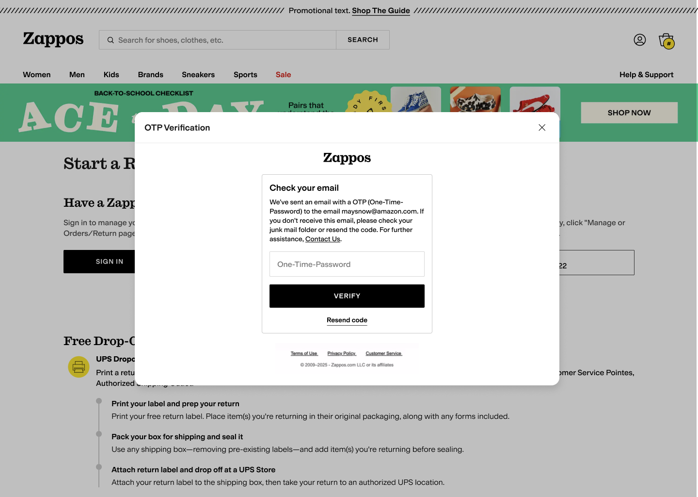
A one-time code gates the order, replacing the old auto-login link
The open tradeoff: every additional check reduces risk and adds a step for a customer who's already frustrated enough to have contacted support. Security and legal own that call; my job is keeping the friction cost visible when they make it.
Stakeholder alignment
Three proposals I made were corrected during review, and all three corrections are reflected in the final design.
Open the lookup to anyone with an email and order number, not just guests.
Parity with Shopbop, guests only. No VOC supports the wider case.
Guests only. I'd asked for more without evidence; the bar runs both ways.
Remove or relabel the returns content on Contact Us.
Deliberate contact deflection. CS owns the page and wants it at the top.
Content kept, treatment changed to Quick Links.
Drop the "Last Updated" line under Shipping.
No US law requires it, but returns moved from 365 days to 60.
Kept. The reason was a customer benefit nobody had written down.
Collaborators
Current status
Copy, UX, and product are approved. UX handoff to development is complete; engineering is building and estimating; visual design lands next, aligned to a page it's designing separately. Nothing is shipped yet, so there are no outcome numbers to report.
The measurement plan: guest-return contacts to customer service should fall, and accounts created with no visible order history should fall. I'd instrument the lookup form: starts, completions, failures, and which of the 8 ingress points sent the customer.
Validation
Thematic analysis of 18 Voice of Customer contacts. Identified the mechanism: guests read an account as required.
A journey-level review and critique with UX, engineering, copy, and legal. Confirmed the design was defensible.
Timeline didn't allow a usability test on the proposed flow before handoff. A critique confirms a design is defensible; it doesn't confirm a guest can complete the task.
5 unmoderated sessions with a return-without-an-account task, plus a first-click test on the 3 renamed pages.
Personal takeaways
The research identified the actual mechanism behind the failure, not just the symptom, so the fix didn't rely on guesswork.
The capability already existed, which turned what looked like a feature request into a cheaper labeling and IA fix across 8 surfaces, shipped faster.
Visual parity has to be structural, not stylistic. Every layout that gave one path a button and the other a text link reproduced the bias under review.
Cross-functional review caught real gaps in scope, IA, and policy that research alone didn't surface, and all three corrections are in the shipped design.