Server Capex Automation
Eliminating development fixes with self-service solutions for ACAPS (AWS Capex System)
Background
As the sole UX designer for multiple AWS Fintech financial planning products, I led the end-to-end design process for a new feature in ACAPS (AWS Capex System) — an internal tool used by AWS foundational Service and Infra Finance teams for server capex planning.
In 2025, I delivered a CFO-level goal to introduce data quality checks and proactive alerts that allow for self-servicing of data remapping, bulk copying, and proxy capabilities into ACAPS.
Impact
This feature supports controllership, improves data accuracy and reliability, and enables S&OP (Sales & Operations Planning) automation by providing Service/Infrastructure Finance users transparency and visibility with self-service solutions.
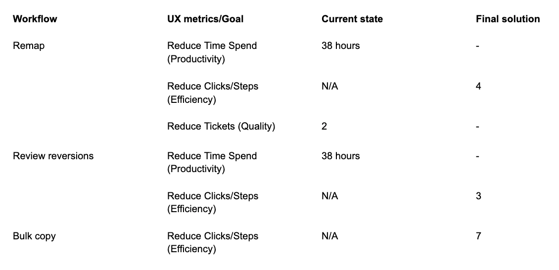
Success metrics included reducing time spent, clicks, and tickets
"This is definitely a better experience than multiple people frantically doing pivot tables and trying to figure out what the issue is." — EC2 (AWS service) Principal Finance user
UX process timeline

Challenge
ACAPS, used in Sales & Operations Planning (S&OP), faced operational burden and customer churn due to a lack of key systems and planning step integrations.
- Manual effort: Finance teams spent 5 working days identifying misalignments.
- High dependency on developers: 38 hours per cycle deploying mitigations, 90% spent on error resolution.
- Inefficient workflows: Users submitted 2+ SIM tickets per cycle and relied on offline tools like Slack for manual corrections.
Solutions
UX involvement defined the business requirements, and I designed a workflow that targets the problem through:
- Detecting mapping issues proactively and alerting users to self-service remaps instead of waiting on developers
- Reviewing and approving system-corrected reverted remaps
- Accessing the workflows at any time in the Forecast Input Details section
- Bulk copying pre-selected plan baselines to improve efficiency
- Improving UX consistency through a design system upgrade
The previous platform
The existing product interface required modernization to address navigational issues and migrate from a deprecated design system.
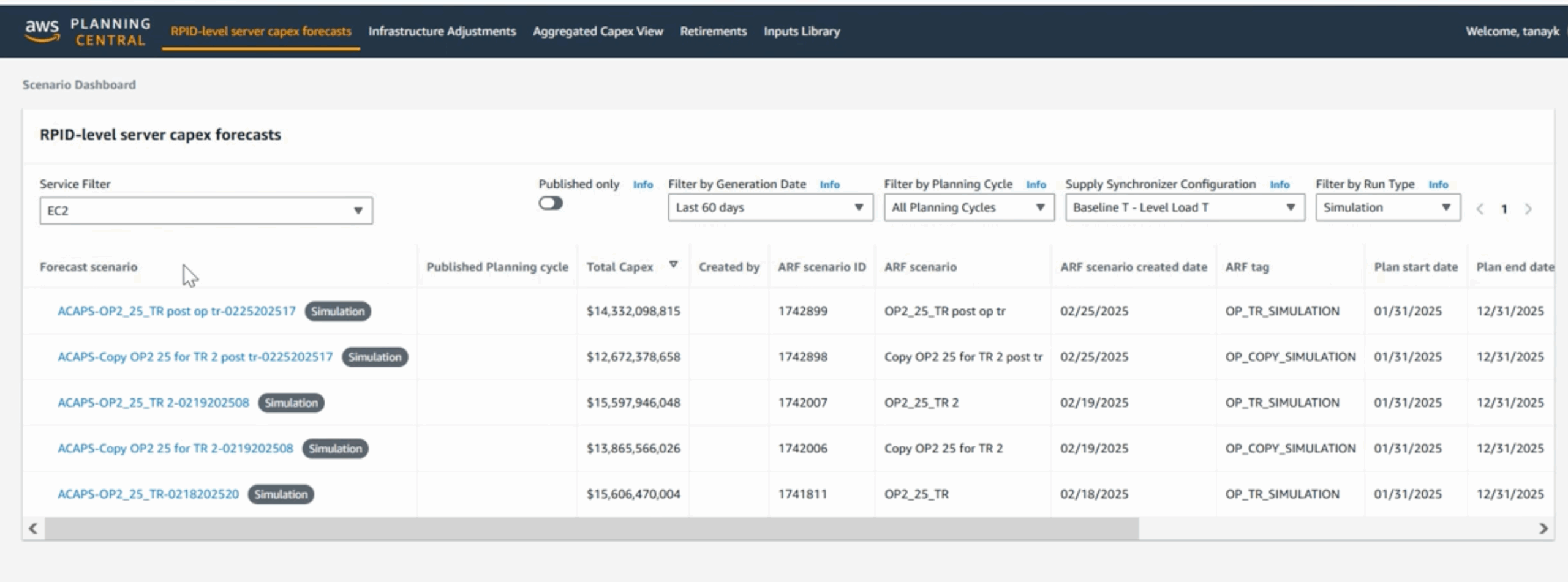
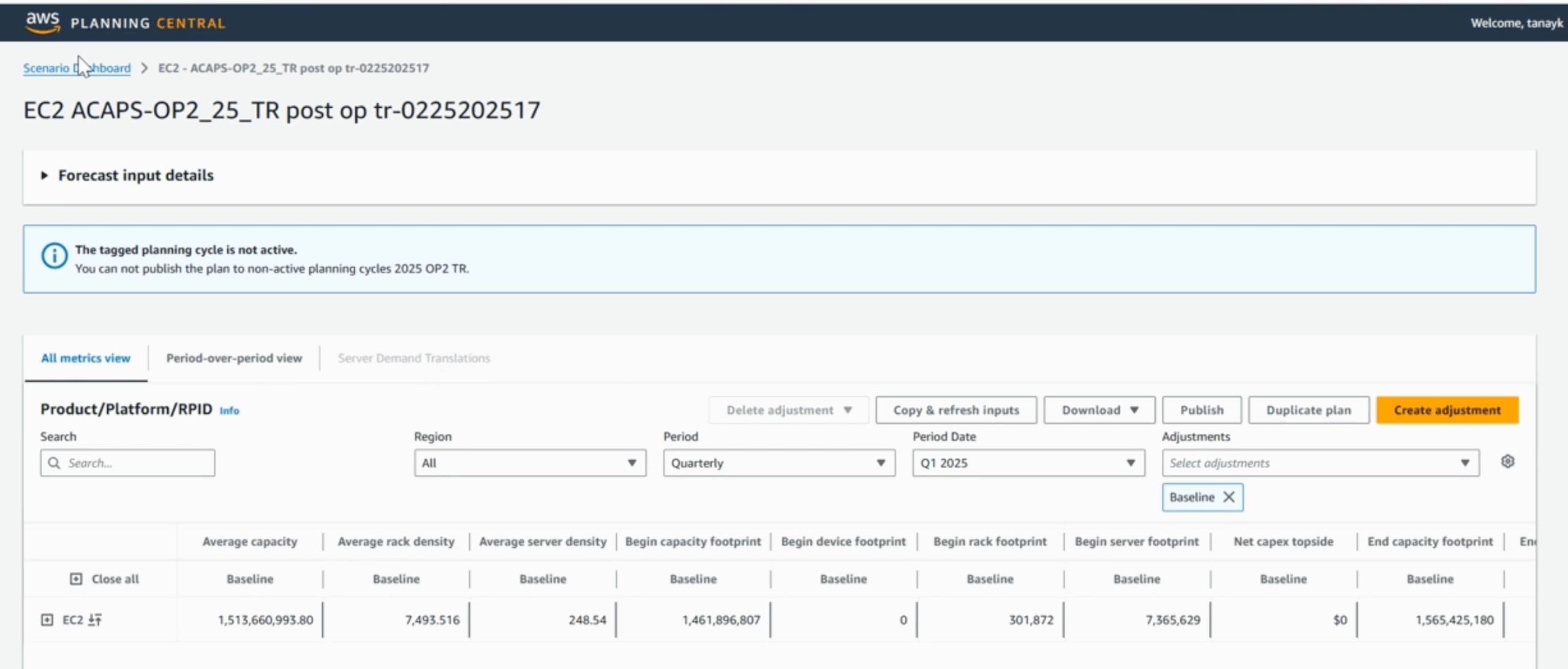
UX navigation issues and debt were fixed along with the design system component upgrade
Iterating in cross-functional sessions
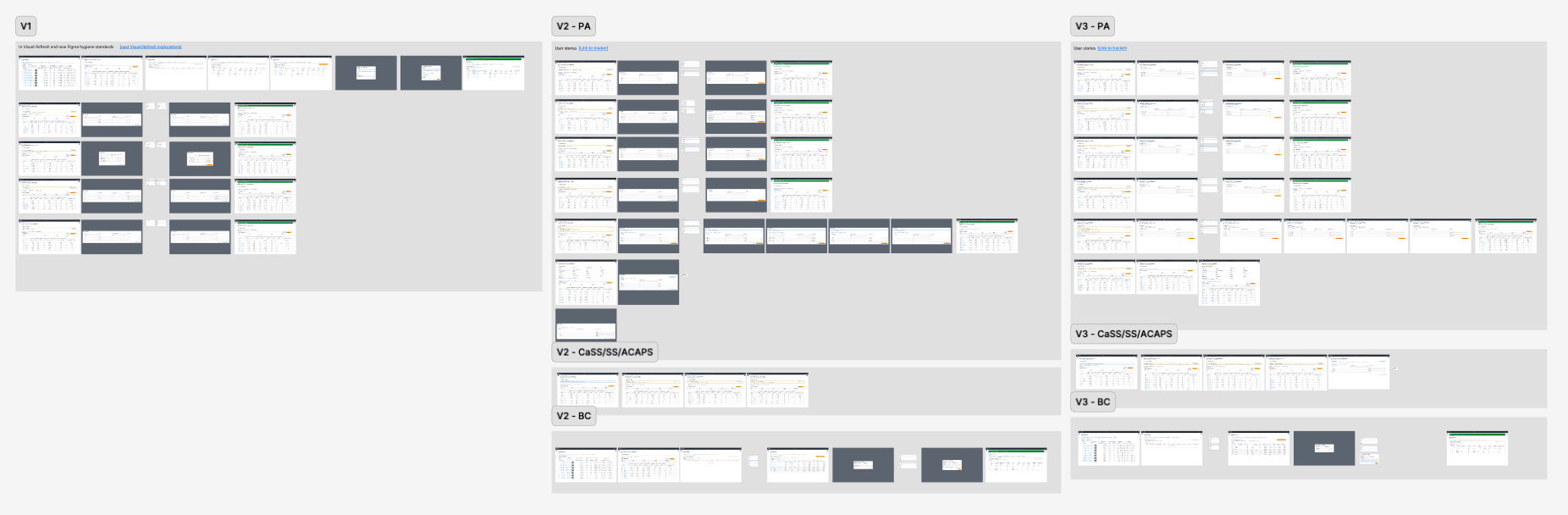
The UX process involved 4 rounds of iterations including 6 cross-functional sessions for alignment on feature requirements. Cross-functional collaboration drove the ideation of automated solutions to replace time-intensive manual processes.
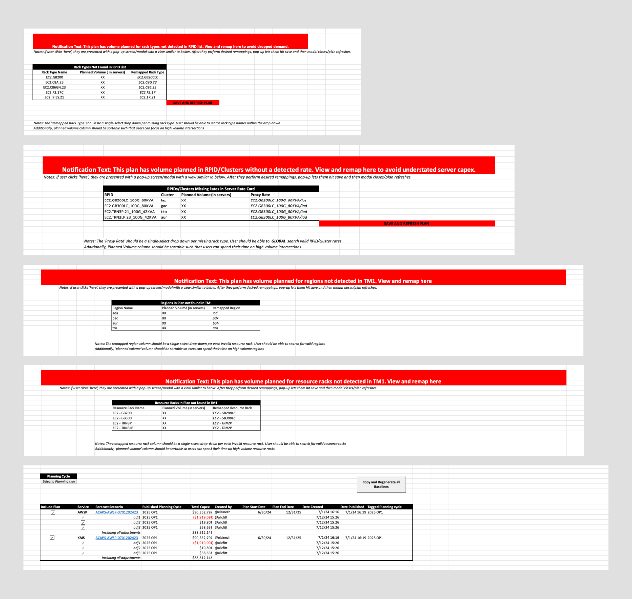
Early notification and remap-table specs, refined with developers across 4 rounds of iteration
Understanding the different users
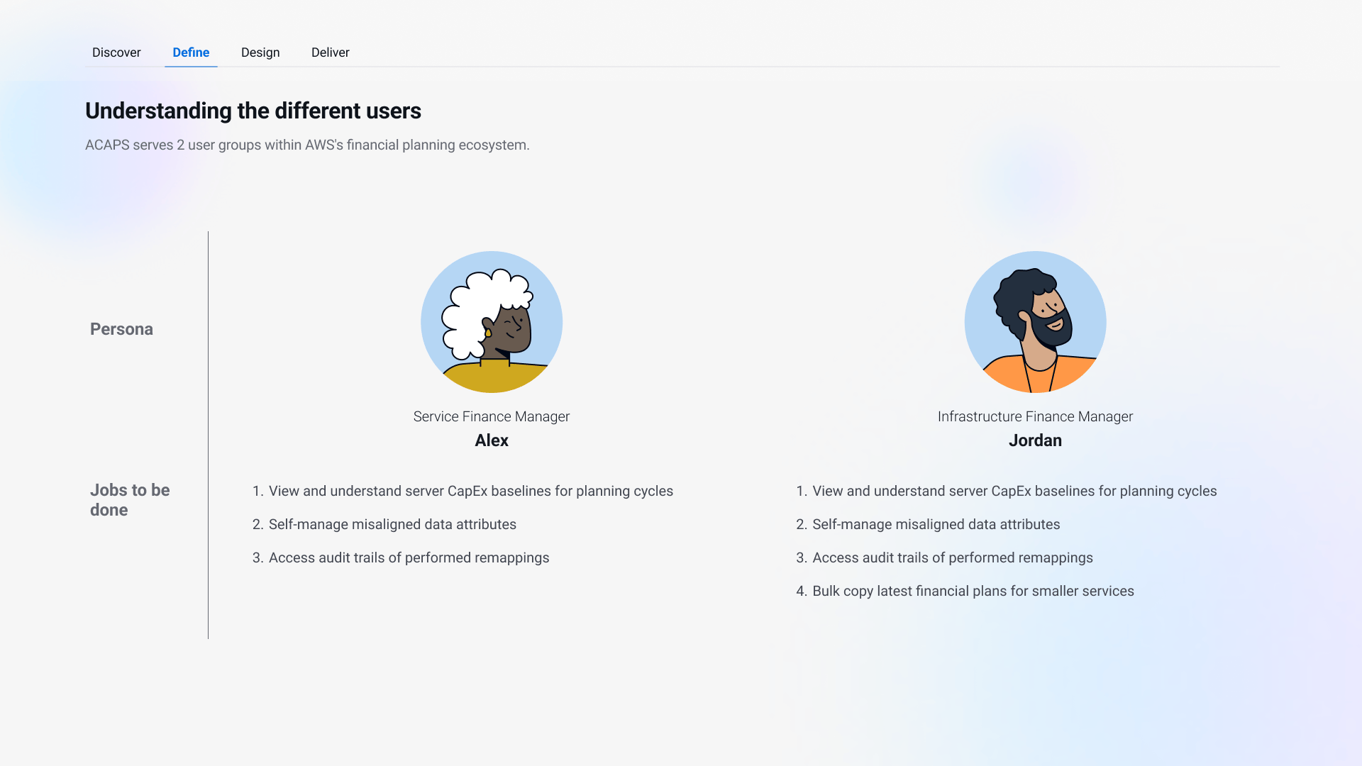
ACAPS serves two user groups within AWS's financial planning ecosystem, both included in usability testing to validate the solution across the complete spectrum — Service Finance Managers like Alex, and Infrastructure Finance Managers like Jordan, who additionally need to replicate planning baselines across multiple services during S&OP cycles.
Testing designs with users
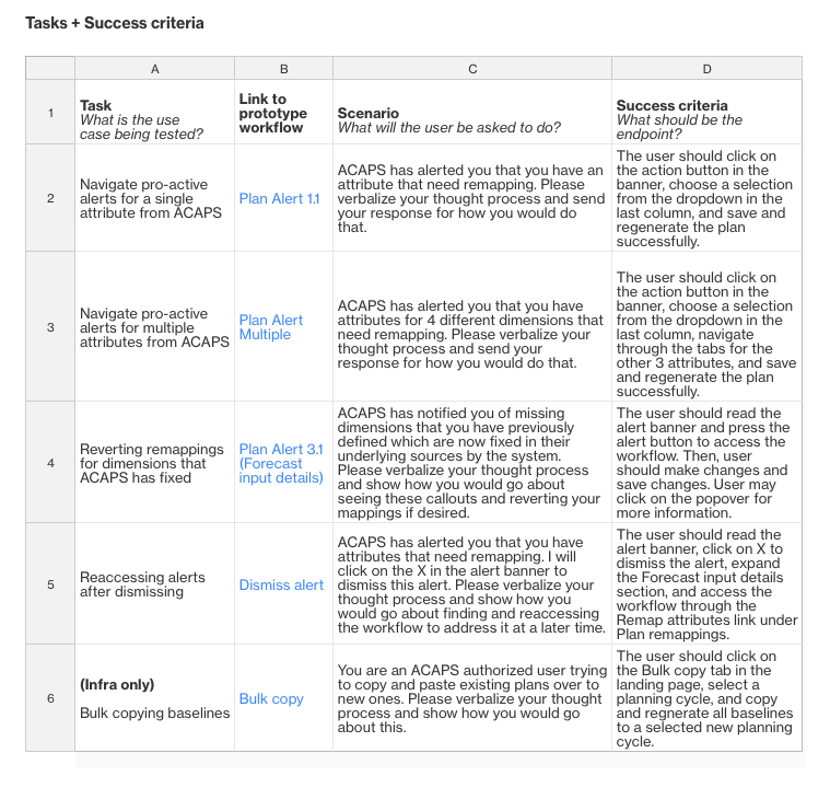
I conducted 2 sessions with Service Finance users and 2 with Infrastructure Finance users via remote moderated usability tests. General feedback on the proactive alerting and remapping experience was intuitive; other suggestions included an easier way to revert remaps.
Key findings
4 key UX value areas were identified and iterated on. Bulk actions reduced the number of clicks and consistent patterns improved discoverability of ingress points.
- Proactive alerting with self-service remaps: ACAPS first detects mapping issues and alerts users to self-service remap.
- Reverting remaps: ACAPS automatically reverts system-corrected remaps, which users can review and submit.
- Ingress point: A link in the Forecast Input Details section serves as an ingress point, accessible any time.
- Bulk copy: Authorized users save time by bulk copying prior plans to active planning cycles.
Design solutions
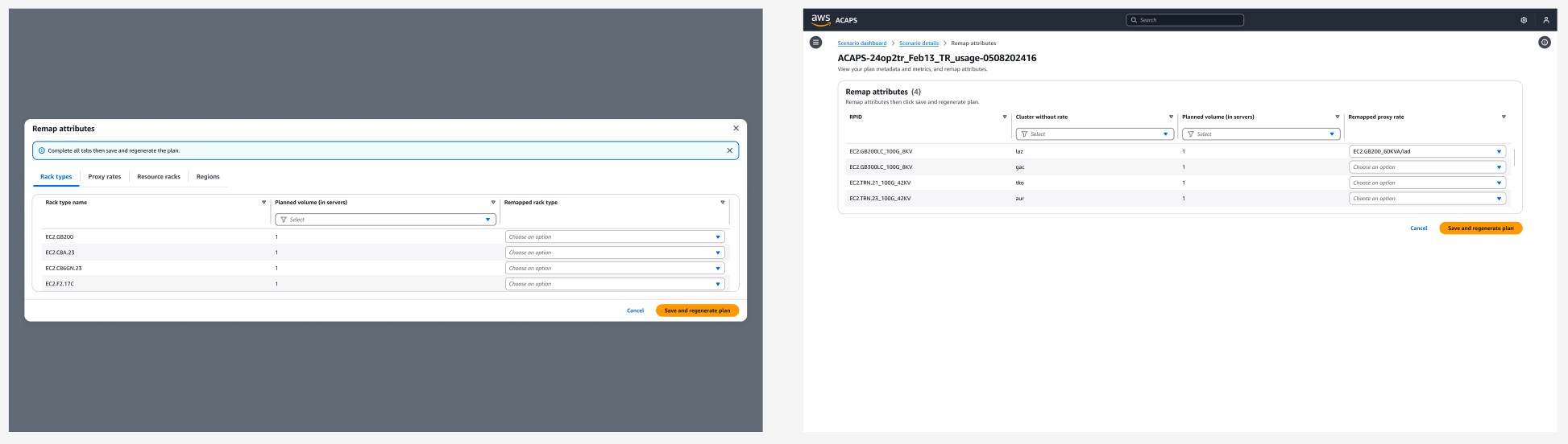
Proactive alerting with self-service remaps
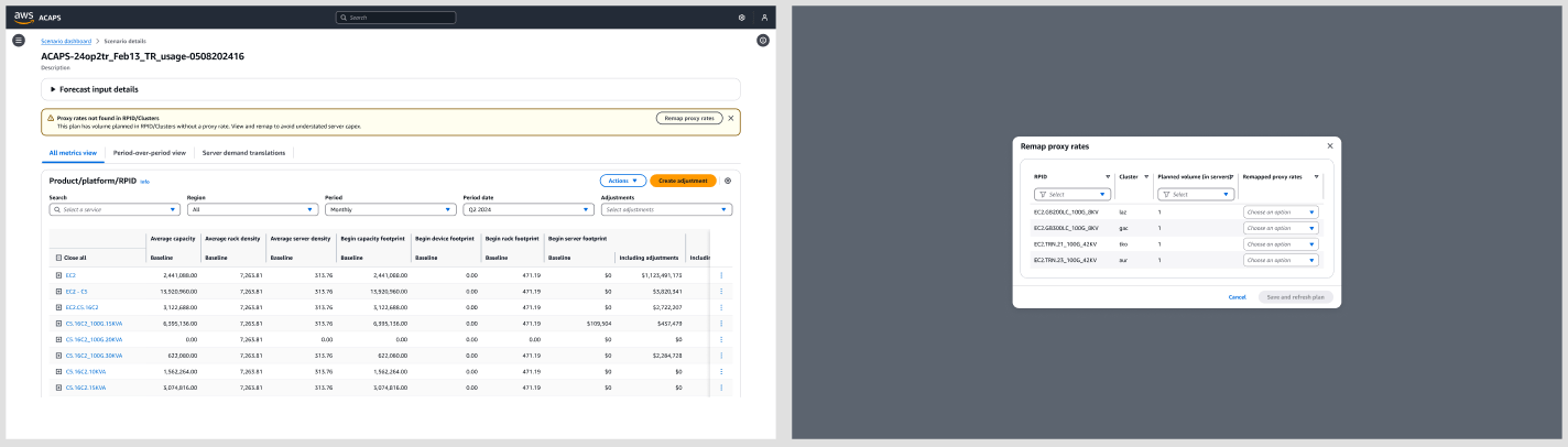
I first explored alert banners with modals, added tabs for mapping multiple attributes, then replaced modals with single-page forms (down to 4 clicks).
Reverting remaps
I used warning indicators and contextual popovers with system-generated results and batch review to simplify the process, reducing steps from 6 clicks to 3.
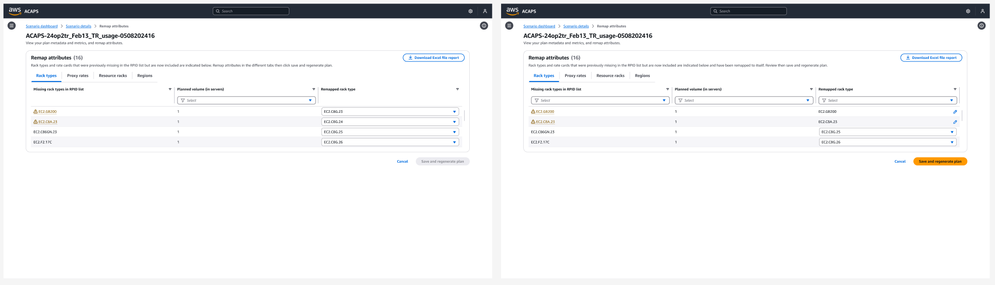
System-generated results with batch review were a key finding in user testing
Ingress point
User testing showed people didn't intuitively know to expand the Forecast Input Details section to access the remapping workflows. I added a "Needs attention" badge in the section header and a direct link, aligning the copy to the alert banner heading.
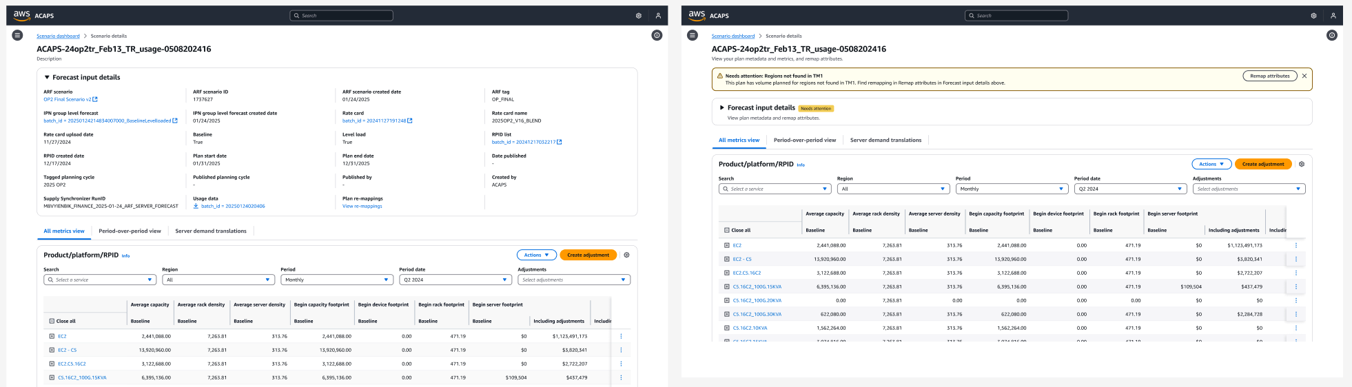
Added the link, revised copy with access instructions, then added a "Needs attention" badge in the header
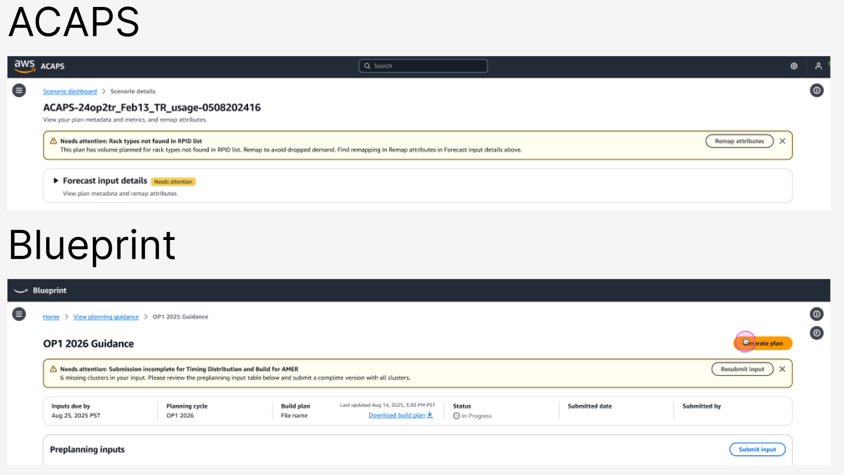
This identified a team primitive opportunity, later applied in another AWS Fintech product (Blueprint)
Bulk copy
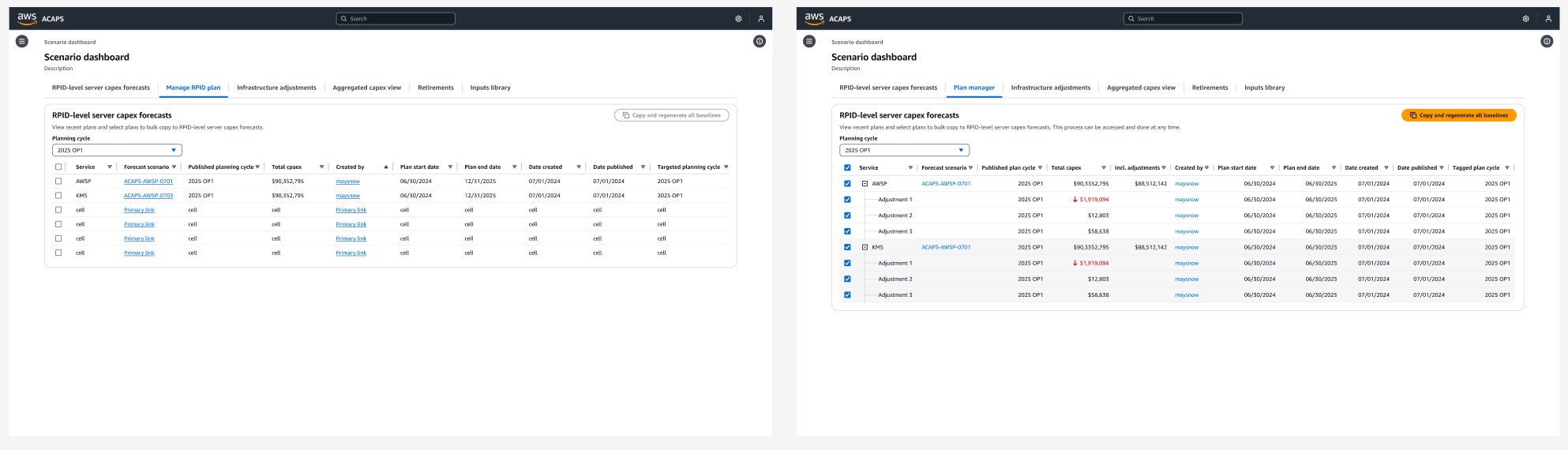
I added a tab for authorized users (Infra Finance Managers) to bulk copy pre-selected plan baselines to new planning cycles, using our team's Data Grid primitive to reduce clicks from 10 to 7.
Current project & product status
- Delivered designs, supported development, and completed UX quality assurance before User Acceptance Testing & launch.
- The team is monitoring user behavior and gathering post-launch feedback.
- Incrementally migrating remaining product workflows into the updated design system.
Personal takeaways
This project was a significant milestone in my UX career, showcasing my ability to lead design solutions that improve operational efficiency, scalability, and cross-team collaboration. By identifying opportunities for team primitives and creating leadership review templates, this work has a lasting impact on our organization's SOP, team velocity, and UX documentation going forward.
Designing for scalability: Think beyond the UX solution working for just my product, to other financial planning tools in the pod so solutions offer a cohesive experience across the entire ecosystem.
User-centered problem solving: Instead of just implementing explicit user requests, focus on the root problem. In testing, users requested a revert button on each line — the real need was a less intrusive, quicker way to revert, which led to automatic system-generated remaps for review instead.